Win $200 La Crema and Valkyries Merchandise — Exclusive Giveaway!
:root {
–primary: #C0C0C0;
–primary-dark: #A9A9A9;
–primary-deep: #808080;
–primary-light:#D3D3D3;
–primary-pale: #F5F5F5;
–accent: #DAA520;
–accent-light: #FFEFD5;
–cream: #fdfcff;
–warm-white: #f9f7ff;
–border: #e9e3ff;
–text-dark: #1c1c1c;
–text-gray: #555555;
–text-light: #888888;
}
.fmsdb-post-wrap * { box-sizing: border-box; }
.fmsdb-post-wrap {
font-family: ‘Inter’, sans-serif;
color: var(–text-dark);
font-size: 17px;
line-height: 1.85;
}
/* ── HEADER ── */
header {
background: linear-gradient(160deg, #FFD700 0%, #FFA500 30%, #FF8C00 65%, #FF4500 100%);
color: #fff;
text-align: center;
padding: 60px 24px 52px;
position: relative;
overflow: hidden;
}
header::before {
content: ”;
position: absolute;
top: -60px; left: -60px; right: -60px; bottom: -60px;
background: radial-gradient(ellipse at 50% 0%, rgba(245,158,11,0.15) 0%, transparent 70%);
pointer-events: none;
}
.status-tag {
display: inline-block;
background: rgba(255,255,255,0.15);
border: 1px solid rgba(255,255,255,0.35);
border-radius: 50px;
padding: 6px 18px;
font-size: 0.78rem;
font-weight: 700;
letter-spacing: 0.08em;
text-transform: uppercase;
margin-bottom: 22px;
color: #fff;
}
header h1 {
font-family: ‘Playfair Display’, serif;
font-size: clamp(2.2rem, 7vw, 4rem);
font-weight: 800;
line-height: 1.1;
margin-bottom: 18px;
}
header h1 span { color: rgba(255,255,255,0.85); font-style: italic; text-shadow: 0 2px 8px rgba(0,0,0,0.3); }
.hero-sub {
font-size: 1.05rem;
color: rgba(255,255,255,0.92);
text-shadow: 0 1px 4px rgba(0,0,0,0.25);
opacity: 1;
max-width: 100%;
margin: 0 0 28px;
line-height: 1.7;
}
.prize-value {
font-family: ‘Playfair Display’, serif;
font-size: clamp(2.4rem, 7vw, 3.8rem);
font-weight: 800;
color: #fff;
line-height: 1;
margin-bottom: 4px;
text-shadow: 0 2px 12px rgba(0,0,0,0.3);
}
.prize-label {
font-size: 0.78rem;
letter-spacing: 0.12em;
text-transform: uppercase;
color: rgba(255,255,255,0.85);
margin-bottom: 28px;
}
/* ── HERO IMAGE ── */
.hero-image-wrap {
margin: 20px auto 24px;
max-width: 620px;
border-radius: 16px;
overflow: hidden;
box-shadow: 0 8px 32px rgba(0,0,0,0.18);
border: none;
}
.hero-img {
width: 100%;
height: auto;
display: block;
object-fit: cover;
}
@media (max-width: 640px) {
.hero-image-wrap {
max-width: 100%;
border-radius: 0;
margin: 16px -24px 20px;
width: calc(100% + 48px);
box-shadow: none;
}
}
.countdown {
display: flex;
justify-content: center;
gap: 12px;
margin-bottom: 30px;
flex-wrap: wrap;
}
.cd-box {
background: rgba(0,0,0,0.3);
border: 1px solid rgba(255,255,255,0.25);
border-radius: 10px;
padding: 12px 18px;
min-width: 72px;
text-align: center;
}
.cd-num {
font-family: ‘Playfair Display’, serif;
font-size: 2rem;
font-weight: 700;
color: var(–accent-light);
line-height: 1;
}
.cd-label {
font-size: 0.65rem;
letter-spacing: 0.1em;
text-transform: uppercase;
opacity: 0.6;
margin-top: 4px;
}
/* ── CTA BUTTON ── */
.cta-btn {
display: inline-block;
background: var(–accent);
color: #1a0533;
font-family: ‘Inter’, sans-serif;
font-size: 1.1rem;
font-weight: 800;
letter-spacing: 0.04em;
text-transform: uppercase;
padding: 16px 44px;
border-radius: 50px;
border: none;
cursor: pointer;
text-decoration: none;
transition: background 0.2s, transform 0.15s;
margin: 8px 0;
}
.cta-btn:hover { background: #fbbf24; transform: translateY(-2px); }
/* ── STAT PILLS ── */
.stat-row {
display: flex;
justify-content: center;
gap: 10px;
flex-wrap: wrap;
margin-top: 20px;
}
.stat-pill {
background: rgba(0,0,0,0.3);
border: 1px solid rgba(255,255,255,0.15);
border-radius: 6px;
padding: 8px 16px;
font-size: 0.82rem;
text-align: center;
}
.stat-pill strong { display: block; font-size: 1.1rem; color: var(–accent-light); font-family: ‘Playfair Display’, serif; }
/* ── SCROLL PROMPT ── */
@keyframes bounceDown {
0%, 100% { transform: translateY(0); }
50% { transform: translateY(8px); }
}
.scroll-prompt {
text-align: center;
padding: 18px 12px;
margin: 8px 0;
}
.scroll-prompt-emoji {
font-size: 2rem;
animation: bounceDown 1.2s ease-in-out infinite;
display: block;
}
.scroll-prompt-text {
font-family: ‘Inter’, sans-serif;
font-size: 0.85rem;
font-weight: 600;
color: rgba(255,255,255,0.8);
letter-spacing: 0.04em;
margin-top: 4px;
}
/* ── TOC ── */
.toc-box {
background: linear-gradient(135deg, var(–warm-white) 0%, #f8f5ff 100%);
border: 2px solid var(–primary);
border-radius: 16px;
padding: 24px 28px;
margin: 32px 0;
box-shadow: 0 4px 16px rgba(0,0,0,0.06);
}
.toc-box .toc-label {
font-size: 0.85rem;
font-weight: 800;
letter-spacing: 0.06em;
text-transform: uppercase;
color: var(–primary);
margin-bottom: 16px;
}
.toc-box ol { padding-left: 0; list-style: none; counter-reset: toc-counter; }
.toc-box ol li {
margin-bottom: 10px;
counter-increment: toc-counter;
padding: 8px 12px;
border-radius: 8px;
transition: background 0.2s;
}
.toc-box ol li:hover { background: rgba(0,0,0,0.04); }
.toc-box ol li a {
color: var(–text-dark);
text-decoration: none;
font-weight: 500;
font-size: 0.95rem;
display: flex;
align-items: center;
gap: 8px;
}
.toc-box ol li a:hover { color: var(–primary); }
.toc-emoji { font-size: 1.2rem; flex-shrink: 0; }
.toc-emoji.bounce { animation: bounceDown 1.2s ease-in-out infinite; }
.toc-box ol li:last-child a {
font-weight: 700;
color: var(–primary);
}
/* ── MAIN CONTENT — wider on desktop but not fully unconstrained ── */
.content-wrap {
width: 100%;
max-width: 100%;
padding: 0 0 60px;
box-sizing: border-box;
}
section {
background: var(–warm-white);
border-radius: 0;
padding: 36px clamp(24px, 8vw, 120px);
margin: 0;
border: none;
border-bottom: 1px solid var(–border);
}
section h2 {
font-family: ‘Playfair Display’, serif;
font-size: 1.7rem;
font-weight: 700;
color: var(–primary-dark);
margin-bottom: 18px;
padding-bottom: 12px;
border-bottom: 2px solid var(–border);
}
section h2 span { color: var(–primary); }
section h3 {
font-family: ‘Inter’, sans-serif;
font-size: 1.05rem;
font-weight: 700;
color: var(–text-dark);
margin: 22px 0 10px;
}
section p {
color: var(–text-gray);
margin-bottom: 16px;
line-height: 1.85;
}
section p:last-child { margin-bottom: 0; }
blockquote {
border-left: 4px solid var(–primary);
background: var(–primary-pale);
padding: 16px 20px;
margin: 20px 0;
border-radius: 0 8px 8px 0;
font-style: italic;
color: var(–text-gray);
font-size: 0.95rem;
}
/* ── PRIZE CARDS ── */
.prize-grid {
display: grid;
grid-template-columns: repeat(auto-fill, minmax(240px, 1fr));
gap: 16px;
margin: 20px 0;
}
.prize-card {
background: linear-gradient(135deg, #f5f3ff 0%, #ede9fe 100%);
border: 2px solid var(–border);
border-top: 5px solid var(–primary);
border-radius: 14px;
padding: 24px 20px;
text-align: center;
}
.prize-card.accent-card {
border-top-color: var(–accent);
background: linear-gradient(135deg, #fffbf0 0%, #fef3c7 100%);
}
.prize-card .pc-emoji { font-size: 2.8rem; display: block; margin-bottom: 10px; }
.prize-card .pc-count {
font-size: 0.85rem;
font-weight: 700;
text-transform: uppercase;
letter-spacing: 0.08em;
color: var(–primary);
margin-bottom: 6px;
}
.prize-card.accent-card .pc-count { color: #b45309; }
.prize-card .pc-name {
font-family: ‘Playfair Display’, serif;
font-size: 1.15rem;
font-weight: 700;
color: var(–text-dark);
margin-bottom: 8px;
}
.prize-card .pc-value {
font-family: ‘Playfair Display’, serif;
font-size: 1.6rem;
font-weight: 700;
color: var(–primary-deep);
margin-bottom: 6px;
}
.prize-card.accent-card .pc-value { color: #92400e; }
.prize-card .pc-note { font-size: 0.85rem; color: var(–text-gray); }
/* ── STEPS ── */
.steps { list-style: none; padding: 0; margin: 20px 0; }
.steps li {
display: flex;
gap: 16px;
align-items: flex-start;
margin-bottom: 18px;
}
.step-num {
background: var(–primary);
color: #fff;
font-weight: 800;
width: 34px;
height: 34px;
border-radius: 50%;
display: flex;
align-items: center;
justify-content: center;
flex-shrink: 0;
margin-top: 2px;
font-size: 1rem;
}
.step-body strong { display: block; font-weight: 700; margin-bottom: 4px; color: var(–text-dark); }
.step-body span { color: var(–text-gray); font-size: 0.95rem; }
/* ── TABLE ── */
.data-table {
width: 100%;
border-collapse: collapse;
margin: 20px 0;
font-size: 0.95rem;
}
.elig-table th {
background: var(–primary-dark);
color: #fff;
font-weight: 700;
text-transform: uppercase;
letter-spacing: 0.05em;
padding: 12px 16px;
text-align: left;
font-size: 0.85rem;
}
.data-table td {
padding: 11px 16px;
border-bottom: 1px solid var(–border);
color: var(–text-gray);
vertical-align: top;
}
.data-table tr:nth-child(even) td { background: var(–primary-pale); }
.data-table td strong { color: var(–text-dark); }
/* ── TIMELINE ── */
.timeline { list-style: none; padding: 0; margin: 20px 0; }
.timeline li {
display: flex;
gap: 16px;
margin-bottom: 16px;
align-items: flex-start;
.timeline-dot {
width: 14px; height: 14px;
background: var(–primary);
border-radius: 50%;
flex-shrink: 0;
margin-top: 6px;
}
.timeline-date { font-weight: 700; color: var(–primary-dark); }
.timeline-event { color: var(–text-dark); font-weight: 600; }
.tl-body strong { display: block; color: var(–text-dark); font-weight: 600; }
.tl-body span { color: var(–text-gray); font-size: 0.93rem; }
/* ── FAQ ── */
.faq-item {
border: 1px solid var(–border);
border-radius: 10px;
margin-bottom: 12px;
overflow: hidden;
}
.faq-q {
width: 100%;
background: var(–warm-white);
border: none;
padding: 16px 20px;
text-align: left;
font-family: ‘Inter’, sans-serif;
font-size: 1rem;
font-weight: 600;
color: var(–text-dark);
cursor: pointer;
display: flex;
justify-content: space-between;
align-items: center;
gap: 12px;
}
.faq-q:hover { background: var(–primary-pale); }
.faq-arrow { font-size: 0.8rem; color: var(–primary); transition: transform 0.25s; flex-shrink: 0; }
.faq-item.open .faq-arrow { transform: rotate(180deg); }
.faq-a {
display: none;
padding: 0 20px 18px;
color: var(–text-gray);
font-size: 0.95rem;
line-height: 1.8;
border-top: 1px solid var(–border);
background: var(–primary-pale);
}
.faq-item.open .faq-a { display: block; }
/* ── RELATED CARDS ── */
.related-grid {
display: grid;
grid-template-columns: repeat(auto-fill, minmax(200px, 1fr));
gap: 14px;
margin: 20px 0;
}
.related-card {
background: var(–warm-white);
border: 1px solid var(–border);
border-radius: 10px;
padding: 16px;
text-decoration: none;
color: var(–text-dark);
transition: border-color 0.2s, transform 0.15s;
display: block;
}
.related-card:hover { border-color: var(–primary); transform: translateY(-2px); }
.related-card .rc-cat {
font-size: 0.68rem;
font-weight: 700;
letter-spacing: 0.1em;
text-transform: uppercase;
color: var(–primary);
margin-bottom: 6px;
}
.related-card .rc-title { font-size: 0.9rem; font-weight: 600; line-height: 1.4; color: var(–text-dark); }
/* ── ENTRY SECTION ── */
.entry-section {
background: linear-gradient(135deg, #FFD700 0%, #FF8C00 100%);
border-radius: 0;
padding: 52px 28px;
text-align: center;
margin: 0;
color: #fff;
box-shadow: none;
}
.entry-section h2 {
font-family: ‘Playfair Display’, serif;
font-size: 2.1rem;
font-weight: 800;
color: #fff;
border: none;
padding: 0;
margin-bottom: 8px;
text-shadow: 0 2px 8px rgba(0,0,0,0.2);
}
.entry-section h2 span { color: rgba(255,255,255,0.9); font-style: italic; }
.entry-section > p { color: rgba(255,255,255,0.88); margin-bottom: 28px; font-size: 1.05rem; }
.entry-stat-grid {
display: grid;
grid-template-columns: repeat(3, 1fr);
gap: 14px;
margin: 0 0 28px;
max-width: 100%;
}
.entry-stat-box {
background: rgba(255,255,255,0.18);
border: 1px solid rgba(255,255,255,0.3);
border-radius: 12px;
padding: 14px 10px;
backdrop-filter: blur(4px);
}
.entry-stat-box .stat-label {
display: block;
font-size: 0.7rem;
font-weight: 700;
text-transform: uppercase;
letter-spacing: 0.08em;
color: rgba(255,255,255,0.7);
margin-bottom: 4px;
}
.entry-stat-box .stat-value {
display: block;
font-size: 1rem;
font-weight: 800;
color: #fff;
line-height: 1.3;
}
@media (max-width: 480px) {
.entry-stat-grid { grid-template-columns: 1fr 1fr; }
.entry-stat-grid .entry-stat-box:last-child { grid-column: 1 / -1; }
}
@media (max-width: 600px) {
section { padding: 24px 18px; }
.entry-section { padding: 28px 18px; }
}
/* ── FULL-WIDTH ADS ── */
.adsbygoogle {
display: block !important;
width: 100% !important;
max-width: 100% !important;
}
Enter to Win Exclusive La Crema,
Valkyries Merchandise
Limited Time Only!
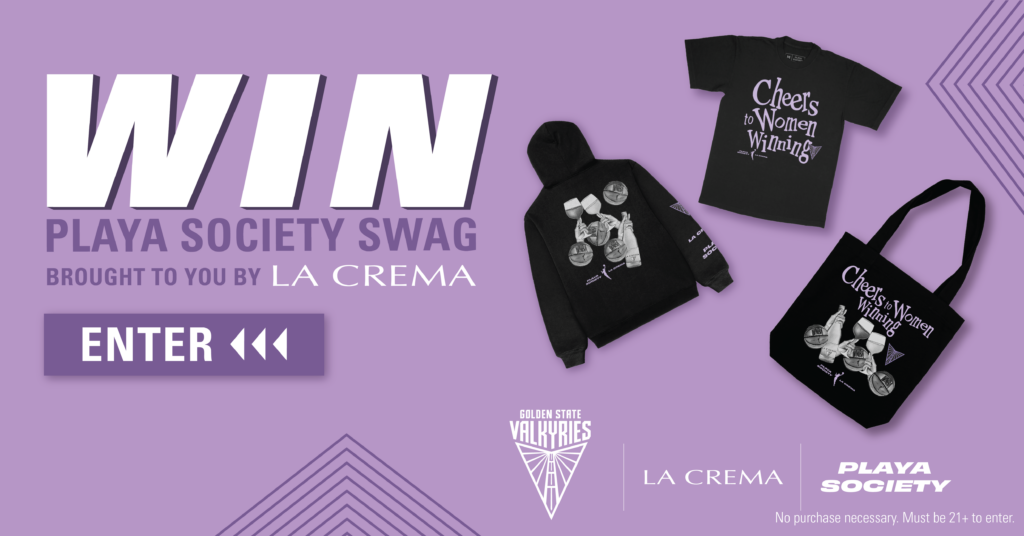
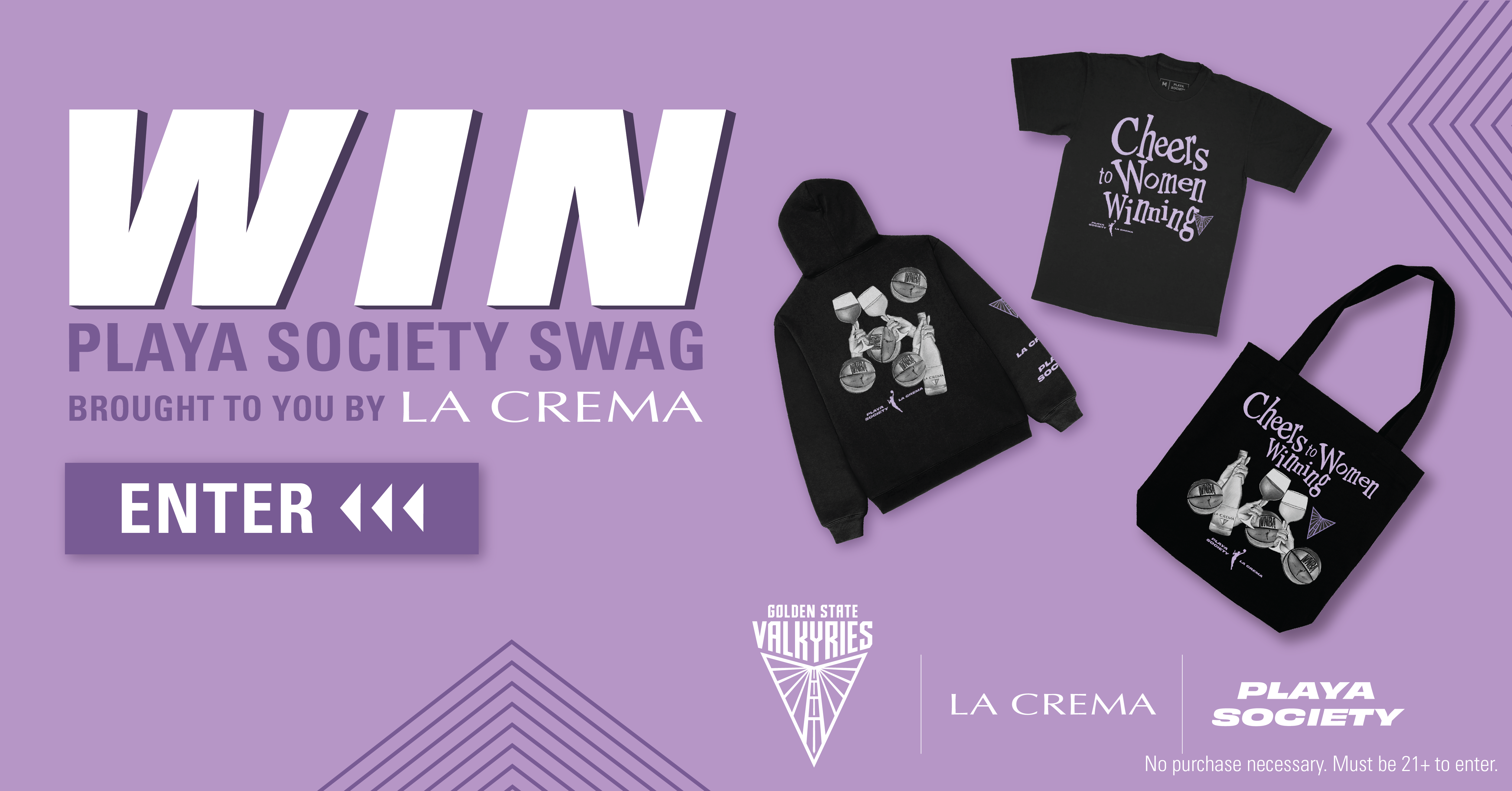
Don't miss your chance to snag amazing La Crema and Valkyries merchandise designed by Playa Society. Enter today and elevate your style!
- 🌟 What Is the La Crema and Valkyries Merchandise Sweepstakes?
- 🎁 The Prizes — $2,000 in Merchandise
- ✍️ How to Enter Step by Step
- ✅ Who Can Enter — Eligibility
- 📅 Timeline & Key Dates
- 💡 Tips to Maximize Your Chances
- 🤔 What Would You Do With the Prize?
- 🏆 Why This Sweepstakes Is Worth Winning
- ❓ Frequently Asked Questions
- 🚀 Register Now — Free Entry!
What Is the La Crema and Valkyries Merchandise Sweepstakes?
Welcome to the La Crema and Valkyries Merchandise Sweepstakes! This exciting opportunity allows you to win exclusive merchandise designed by Playa Society.
With 10 grand prizes valued at $200 each, this is your chance to elevate your collection with unique items that showcase the perfect blend of style and sophistication.
The Prizes — $2,000 in Merchandise
How to Enter Step by Step
- 1
Visit the Entry Page
Go to the official entry page at La Crema Sweepstakes.
- 2
Complete the Form
Fill out the entry form with your details.
- 3
Submit Your Entry
Submit your entry and cross your fingers for luck!
Who Can Enter — Eligibility
| Field | Details |
|---|---|
| Age | 21+ |
| Location | USA Only |
| Entry Type | One Time Entry |
Timeline & Key Dates
Tips to Maximize Your Chances
- Check your email for confirmation after entering.
- Share with friends to increase excitement!
- Follow La Crema on social media for updates.
- Stay tuned for winner announcements!
🌟 What Could You Do With This Prize?
Winning the La Crema and Valkyries merchandise could transform how you express your personal style. Imagine wearing a uniquely designed piece while enjoying a wine-tasting event, or gifting it to a fellow wine enthusiast who appreciates the artistry of Playa Society.
These exclusive items are not just merchandise; they’re conversation starters that can elevate your social gatherings. Whether you’re hosting a dinner party or attending a casual meetup, you’ll stand out with La Crema’s signature touch.
💡 Why This Sweepstakes Is Worth Entering
This sweepstakes is brought to you by La Crema, a brand known for its high-quality wines and commitment to craftsmanship. With only 10 grand prizes available, your odds of winning are fantastic, making this giveaway a must-enter for any La Crema fan.
Freebiemom readers love exclusive giveaways like this, as they provide a chance to win unique items without any cost. Don’t miss out on this special opportunity to enhance your collection and enjoy the luxury of La Crema merchandise!
Frequently Asked Questions
There will be 10 winners.
Each prize is valued at $200.
You must be 21 years or older and a resident of the USA.
More Free Sweepstakes to Enter
Ready to Enter Free?
It's easy to enter and win amazing merchandise! Don't wait—take your shot at this exclusive giveaway now!
$200
September 1, 2026
One-time
Helpful Freebie Mom Guides
Keep going