Win a $2,558 Blackstone Pavilion — Enter the Modelo Summer Giveaway!
:root {
–primary: #3A5B3A;
–primary-dark: #2C423A;
–primary-deep: #1F2A2A;
–primary-light:#4C7A4C;
–primary-pale: #A7CFA7;
–accent: #FFC107;
–accent-light: #FFE082;
–cream: #fdfcff;
–warm-white: #f9f7ff;
–border: #e9e3ff;
–text-dark: #1c1c1c;
–text-gray: #555555;
–text-light: #888888;
}
.fmsdb-post-wrap * { box-sizing: border-box; }
.fmsdb-post-wrap {
font-family: ‘Inter’, sans-serif;
color: var(–text-dark);
font-size: 17px;
line-height: 1.85;
}
/* ── HEADER ── */
header {
background: linear-gradient(160deg, #FFCC00 0%, #FFB300 30%, #FFA000 65%, #FF8F00 100%);
color: #fff;
text-align: center;
padding: 60px 24px 52px;
position: relative;
overflow: hidden;
}
header::before {
content: ”;
position: absolute;
top: -60px; left: -60px; right: -60px; bottom: -60px;
background: radial-gradient(ellipse at 50% 0%, rgba(245,158,11,0.15) 0%, transparent 70%);
pointer-events: none;
}
.status-tag {
display: inline-block;
background: rgba(255,255,255,0.15);
border: 1px solid rgba(255,255,255,0.35);
border-radius: 50px;
padding: 6px 18px;
font-size: 0.78rem;
font-weight: 700;
letter-spacing: 0.08em;
text-transform: uppercase;
margin-bottom: 22px;
color: #fff;
}
header h1 {
font-family: ‘Playfair Display’, serif;
font-size: clamp(2.2rem, 7vw, 4rem);
font-weight: 800;
line-height: 1.1;
margin-bottom: 18px;
}
header h1 span { color: rgba(255,255,255,0.85); font-style: italic; text-shadow: 0 2px 8px rgba(0,0,0,0.3); }
.hero-sub {
font-size: 1.05rem;
color: rgba(255,255,255,0.92);
text-shadow: 0 1px 4px rgba(0,0,0,0.25);
opacity: 1;
max-width: 100%;
margin: 0 0 28px;
line-height: 1.7;
}
.prize-value {
font-family: ‘Playfair Display’, serif;
font-size: clamp(2.4rem, 7vw, 3.8rem);
font-weight: 800;
color: #fff;
line-height: 1;
margin-bottom: 4px;
text-shadow: 0 2px 12px rgba(0,0,0,0.3);
}
.prize-label {
font-size: 0.78rem;
letter-spacing: 0.12em;
text-transform: uppercase;
color: rgba(255,255,255,0.85);
margin-bottom: 28px;
}
/* ── HERO IMAGE ── */
.hero-image-wrap {
margin: 20px auto 24px;
max-width: 620px;
border-radius: 16px;
overflow: hidden;
box-shadow: 0 8px 32px rgba(0,0,0,0.18);
border: none;
}
.hero-img {
width: 100%;
height: auto;
display: block;
object-fit: cover;
}
@media (max-width: 640px) {
.hero-image-wrap {
max-width: 100%;
border-radius: 0;
margin: 16px -24px 20px;
width: calc(100% + 48px);
box-shadow: none;
}
}
.countdown {
display: flex;
justify-content: center;
gap: 12px;
margin-bottom: 30px;
flex-wrap: wrap;
}
.cd-box {
background: rgba(0,0,0,0.3);
border: 1px solid rgba(255,255,255,0.25);
border-radius: 10px;
padding: 12px 18px;
min-width: 72px;
text-align: center;
}
.cd-num {
font-family: ‘Playfair Display’, serif;
font-size: 2rem;
font-weight: 700;
color: var(–accent-light);
line-height: 1;
}
.cd-label {
font-size: 0.65rem;
letter-spacing: 0.1em;
text-transform: uppercase;
opacity: 0.6;
margin-top: 4px;
}
/* ── CTA BUTTON ── */
.cta-btn {
display: inline-block;
background: var(–accent);
color: #1a0533;
font-family: ‘Inter’, sans-serif;
font-size: 1.1rem;
font-weight: 800;
letter-spacing: 0.04em;
text-transform: uppercase;
padding: 16px 44px;
border-radius: 50px;
border: none;
cursor: pointer;
text-decoration: none;
transition: background 0.2s, transform 0.15s;
margin: 8px 0;
}
.cta-btn:hover { background: #fbbf24; transform: translateY(-2px); }
/* ── STAT PILLS ── */
.stat-row {
display: flex;
justify-content: center;
gap: 10px;
flex-wrap: wrap;
margin-top: 20px;
}
.stat-pill {
background: rgba(0,0,0,0.3);
border: 1px solid rgba(255,255,255,0.15);
border-radius: 6px;
padding: 8px 16px;
font-size: 0.82rem;
text-align: center;
}
.stat-pill strong { display: block; font-size: 1.1rem; color: var(–accent-light); font-family: ‘Playfair Display’, serif; }
/* ── SCROLL PROMPT ── */
@keyframes bounceDown {
0%, 100% { transform: translateY(0); }
50% { transform: translateY(8px); }
}
.scroll-prompt {
text-align: center;
padding: 18px 12px;
margin: 8px 0;
}
.scroll-prompt-emoji {
font-size: 2rem;
animation: bounceDown 1.2s ease-in-out infinite;
display: block;
}
.scroll-prompt-text {
font-family: ‘Inter’, sans-serif;
font-size: 0.85rem;
font-weight: 600;
color: rgba(255,255,255,0.8);
letter-spacing: 0.04em;
margin-top: 4px;
}
/* ── TOC ── */
.toc-box {
background: linear-gradient(135deg, var(–warm-white) 0%, #f8f5ff 100%);
border: 2px solid var(–primary);
border-radius: 16px;
padding: 24px 28px;
margin: 32px 0;
box-shadow: 0 4px 16px rgba(0,0,0,0.06);
}
.toc-box .toc-label {
font-size: 0.85rem;
font-weight: 800;
letter-spacing: 0.06em;
text-transform: uppercase;
color: var(–primary);
margin-bottom: 16px;
}
.toc-box ol { padding-left: 0; list-style: none; counter-reset: toc-counter; }
.toc-box ol li {
margin-bottom: 10px;
counter-increment: toc-counter;
padding: 8px 12px;
border-radius: 8px;
transition: background 0.2s;
}
.toc-box ol li:hover { background: rgba(0,0,0,0.04); }
.toc-box ol li a {
color: var(–text-dark);
text-decoration: none;
font-weight: 500;
font-size: 0.95rem;
display: flex;
align-items: center;
gap: 8px;
}
.toc-box ol li a:hover { color: var(–primary); }
.toc-emoji { font-size: 1.2rem; flex-shrink: 0; }
.toc-emoji.bounce { animation: bounceDown 1.2s ease-in-out infinite; }
.toc-box ol li:last-child a {
font-weight: 700;
color: var(–primary);
}
/* ── MAIN CONTENT — wider on desktop but not fully unconstrained ── */
.content-wrap {
width: 100%;
max-width: 100%;
padding: 0 0 60px;
box-sizing: border-box;
}
section {
background: var(–warm-white);
border-radius: 0;
padding: 36px clamp(24px, 8vw, 120px);
margin: 0;
border: none;
border-bottom: 1px solid var(–border);
}
section h2 {
font-family: ‘Playfair Display’, serif;
font-size: 1.7rem;
font-weight: 700;
color: var(–primary-dark);
margin-bottom: 18px;
padding-bottom: 12px;
border-bottom: 2px solid var(–border);
}
section h2 span { color: var(–primary); }
section h3 {
font-family: ‘Inter’, sans-serif;
font-size: 1.05rem;
font-weight: 700;
color: var(–text-dark);
margin: 22px 0 10px;
}
section p {
color: var(–text-gray);
margin-bottom: 16px;
line-height: 1.85;
}
section p:last-child { margin-bottom: 0; }
blockquote {
border-left: 4px solid var(–primary);
background: var(–primary-pale);
padding: 16px 20px;
margin: 20px 0;
border-radius: 0 8px 8px 0;
font-style: italic;
color: var(–text-gray);
font-size: 0.95rem;
}
/* ── PRIZE CARDS ── */
.prize-grid {
display: grid;
grid-template-columns: repeat(auto-fill, minmax(240px, 1fr));
gap: 16px;
margin: 20px 0;
}
.prize-card {
background: linear-gradient(135deg, #f5f3ff 0%, #ede9fe 100%);
border: 2px solid var(–border);
border-top: 5px solid var(–primary);
border-radius: 14px;
padding: 24px 20px;
text-align: center;
}
.prize-card.accent-card {
border-top-color: var(–accent);
background: linear-gradient(135deg, #fffbf0 0%, #fef3c7 100%);
}
.prize-card .pc-emoji { font-size: 2.8rem; display: block; margin-bottom: 10px; }
.prize-card .pc-count {
font-size: 0.85rem;
font-weight: 700;
text-transform: uppercase;
letter-spacing: 0.08em;
color: var(–primary);
margin-bottom: 6px;
}
.prize-card.accent-card .pc-count { color: #b45309; }
.prize-card .pc-name {
font-family: ‘Playfair Display’, serif;
font-size: 1.15rem;
font-weight: 700;
color: var(–text-dark);
margin-bottom: 8px;
}
.prize-card .pc-value {
font-family: ‘Playfair Display’, serif;
font-size: 1.6rem;
font-weight: 700;
color: var(–primary-deep);
margin-bottom: 6px;
}
.prize-card.accent-card .pc-value { color: #92400e; }
.prize-card .pc-note { font-size: 0.85rem; color: var(–text-gray); }
/* ── STEPS ── */
.steps { list-style: none; padding: 0; margin: 20px 0; }
.steps li {
display: flex;
gap: 16px;
align-items: flex-start;
margin-bottom: 18px;
}
.step-num {
background: var(–primary);
color: #fff;
font-weight: 800;
width: 34px;
height: 34px;
border-radius: 50%;
display: flex;
align-items: center;
justify-content: center;
flex-shrink: 0;
margin-top: 2px;
font-size: 1rem;
}
.step-body strong { display: block; font-weight: 700; margin-bottom: 4px; color: var(–text-dark); }
.step-body span { color: var(–text-gray); font-size: 0.95rem; }
/* ── TABLE ── */
.data-table {
width: 100%;
border-collapse: collapse;
margin: 20px 0;
font-size: 0.95rem;
}
.elig-table th {
background: var(–primary-dark);
color: #fff;
font-weight: 700;
text-transform: uppercase;
letter-spacing: 0.05em;
padding: 12px 16px;
text-align: left;
font-size: 0.85rem;
}
.data-table td {
padding: 11px 16px;
border-bottom: 1px solid var(–border);
color: var(–text-gray);
vertical-align: top;
}
.data-table tr:nth-child(even) td { background: var(–primary-pale); }
.data-table td strong { color: var(–text-dark); }
/* ── TIMELINE ── */
.timeline { list-style: none; padding: 0; margin: 20px 0; }
.timeline li {
display: flex;
gap: 16px;
margin-bottom: 16px;
align-items: flex-start;
.timeline-dot {
width: 14px; height: 14px;
background: var(–primary);
border-radius: 50%;
flex-shrink: 0;
margin-top: 6px;
}
.timeline-date { font-weight: 700; color: var(–primary-dark); }
.timeline-event { color: var(–text-dark); font-weight: 600; }
.tl-body strong { display: block; color: var(–text-dark); font-weight: 600; }
.tl-body span { color: var(–text-gray); font-size: 0.93rem; }
/* ── FAQ ── */
.faq-item {
border: 1px solid var(–border);
border-radius: 10px;
margin-bottom: 12px;
overflow: hidden;
}
.faq-q {
width: 100%;
background: var(–warm-white);
border: none;
padding: 16px 20px;
text-align: left;
font-family: ‘Inter’, sans-serif;
font-size: 1rem;
font-weight: 600;
color: var(–text-dark);
cursor: pointer;
display: flex;
justify-content: space-between;
align-items: center;
gap: 12px;
}
.faq-q:hover { background: var(–primary-pale); }
.faq-arrow { font-size: 0.8rem; color: var(–primary); transition: transform 0.25s; flex-shrink: 0; }
.faq-item.open .faq-arrow { transform: rotate(180deg); }
.faq-a {
display: none;
padding: 0 20px 18px;
color: var(–text-gray);
font-size: 0.95rem;
line-height: 1.8;
border-top: 1px solid var(–border);
background: var(–primary-pale);
}
.faq-item.open .faq-a { display: block; }
/* ── RELATED CARDS ── */
.related-grid {
display: grid;
grid-template-columns: repeat(auto-fill, minmax(200px, 1fr));
gap: 14px;
margin: 20px 0;
}
.related-card {
background: var(–warm-white);
border: 1px solid var(–border);
border-radius: 10px;
padding: 16px;
text-decoration: none;
color: var(–text-dark);
transition: border-color 0.2s, transform 0.15s;
display: block;
}
.related-card:hover { border-color: var(–primary); transform: translateY(-2px); }
.related-card .rc-cat {
font-size: 0.68rem;
font-weight: 700;
letter-spacing: 0.1em;
text-transform: uppercase;
color: var(–primary);
margin-bottom: 6px;
}
.related-card .rc-title { font-size: 0.9rem; font-weight: 600; line-height: 1.4; color: var(–text-dark); }
/* ── ENTRY SECTION ── */
.entry-section {
background: linear-gradient(135deg, #FFCC00 0%, #FFA000 100%);
border-radius: 0;
padding: 52px 28px;
text-align: center;
margin: 0;
color: #fff;
box-shadow: none;
}
.entry-section h2 {
font-family: ‘Playfair Display’, serif;
font-size: 2.1rem;
font-weight: 800;
color: #fff;
border: none;
padding: 0;
margin-bottom: 8px;
text-shadow: 0 2px 8px rgba(0,0,0,0.2);
}
.entry-section h2 span { color: rgba(255,255,255,0.9); font-style: italic; }
.entry-section > p { color: rgba(255,255,255,0.88); margin-bottom: 28px; font-size: 1.05rem; }
.entry-stat-grid {
display: grid;
grid-template-columns: repeat(3, 1fr);
gap: 14px;
margin: 0 0 28px;
max-width: 100%;
}
.entry-stat-box {
background: rgba(255,255,255,0.18);
border: 1px solid rgba(255,255,255,0.3);
border-radius: 12px;
padding: 14px 10px;
backdrop-filter: blur(4px);
}
.entry-stat-box .stat-label {
display: block;
font-size: 0.7rem;
font-weight: 700;
text-transform: uppercase;
letter-spacing: 0.08em;
color: rgba(255,255,255,0.7);
margin-bottom: 4px;
}
.entry-stat-box .stat-value {
display: block;
font-size: 1rem;
font-weight: 800;
color: #fff;
line-height: 1.3;
}
@media (max-width: 480px) {
.entry-stat-grid { grid-template-columns: 1fr 1fr; }
.entry-stat-grid .entry-stat-box:last-child { grid-column: 1 / -1; }
}
@media (max-width: 600px) {
section { padding: 24px 18px; }
.entry-section { padding: 28px 18px; }
}
/* ── FULL-WIDTH ADS ── */
.adsbygoogle {
display: block !important;
width: 100% !important;
max-width: 100% !important;
}
Grill All Summer Long,
Win Amazing Prizes,
Join the Fun Today!
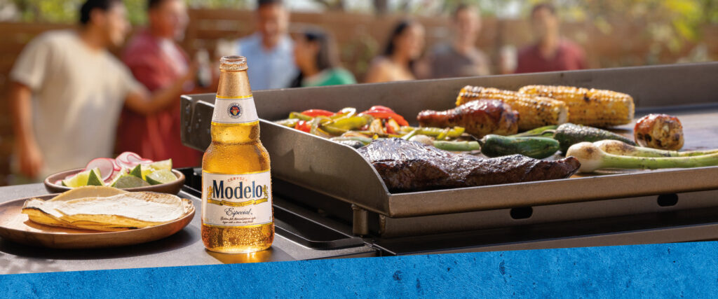
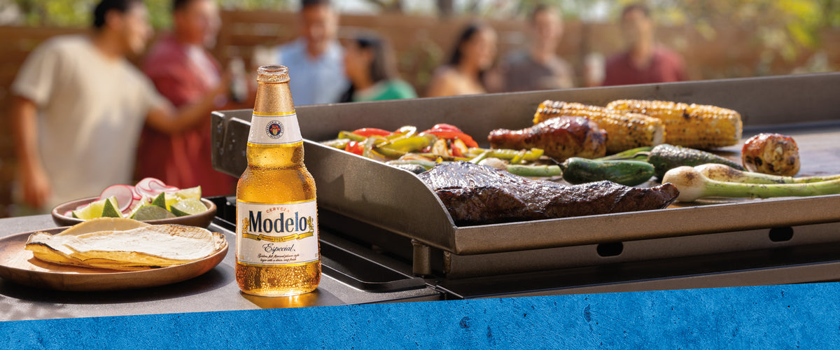
Get ready for summer barbecues with incredible prizes from Modelo! Enter now for a chance to win big!
- 🌟 What Is the Modelo Summer 2026 Sweepstakes?
- 🎁 The Prizes — $102,960 in prizes!
- ✍️ How to Enter Step by Step
- ✅ Who Can Enter — Eligibility
- 📅 Timeline & Key Dates
- 💡 Tips to Maximize Your Chances
- 🤔 What Would You Do With the Prize?
- 🏆 Why This Sweepstakes Is Worth Winning
- ❓ Frequently Asked Questions
- 🚀 Register Now — Free Entry!
What Is the Modelo Summer 2026 Sweepstakes?
The Modelo Summer 2026 Sweepstakes is your chance to win amazing outdoor grilling prizes just in time for summer festivities! Whether you’re a grilling enthusiast or just enjoy outdoor gatherings, this sweepstakes offers something for everyone.
Enter daily for a chance to win a variety of prizes including the grand prize Blackstone Pavilion and more! Don’t miss out on the fun!
The Prizes — $102,960 in prizes!
How to Enter Step by Step
- 1
Visit the Entry Page
Go to the Modelo Summer Sweepstakes entry page.
- 2
Fill Out the Entry Form
Complete the online entry form with your details.
- 3
Submit Your Entry
Hit submit and come back daily for more chances to win!
Who Can Enter — Eligibility
| Field | Details |
|---|---|
| Age | 21+ |
| Location | 50 United States and DC |
| Entry Method | Online |
Timeline & Key Dates
Tips to Maximize Your Chances
- Enter daily for more chances to win!
- Share with friends to increase excitement!
- Follow the rules to ensure your entry counts!
- Stay tuned for the winner announcement!
🌟 What Could You Do With This Prize?
Imagine hosting the ultimate summer barbecue with your friends and family, all thanks to the incredible prizes from the Modelo Summer 2026 Sweepstakes! Picture yourself flipping burgers on the Blackstone thirty-six-inch Griddle Grill, while your guests enjoy refreshing drinks from the stylish Igloo Party Bar cooler. You’ll be the star of every gathering!
With the grand prize Blackstone Pavilion, you can create an outdoor oasis that’s perfect for any occasion. Not only does it provide shade, but it also enhances your backyard’s aesthetic. Imagine late-night gatherings under the stars, grilling delicious meals and making unforgettable memories. Plus, with the cash towards assembly, setting it up will be a breeze!
💡 Why This Sweepstakes Is Worth Entering
Modelo is a brand synonymous with quality and fun, making this sweepstakes an exciting opportunity for all outdoor enthusiasts. With a total prize value of $102,960, the odds are in your favor to win something spectacular—whether it’s the grand prize or one of the many monthly prizes!
Freebiemom readers love giveaways like this because they provide a chance to win fantastic prizes without spending a dime. The Modelo Summer 2026 Sweepstakes is not just another giveaway; it’s a celebration of summer and outdoor living. Don’t miss your chance to be part of it!
Frequently Asked Questions
Visit the entry URL and fill out the online form.
You must be 21 years or older and reside in the 50 United States or DC.
Winners will be announced in August 2026.
More Free Sweepstakes to Enter
Ready to Enter Free?
Don't miss your chance to win these amazing summer prizes! Enter daily for more chances to win.
$102,960
August 15, 2026
Daily
Helpful Freebie Mom Guides
Keep going