Win a $400 Dinner-and-Movie Bundle
:root {
–tmobile: #e20074;
–tmobile-dark: #a00053;
–ink: #111114;
–soft-ink: #34343b;
–muted: #777781;
–paper: #ffffff;
–panel: #f8f8fb;
–line: #e7e7ee;
–black: #050506;
–yellow: #fff2a6;
–green: #d9ffe6;
–radius: 24px;
–shadow: 0 18px 50px rgba(17,17,20,.13);
}
* { box-sizing: border-box; }
html { scroll-behavior: smooth; }
body {
margin: 0;
color: var(–ink);
background: linear-gradient(180deg, #fff 0%, #fbf7ff 42%, #fff 100%);
font-family: -apple-system, BlinkMacSystemFont, “Segoe UI”, Roboto, Helvetica, Arial, sans-serif;
font-size: 20px;
line-height: 1.82;
}
a { color: inherit; }
.progress {
position: fixed;
top: 0;
left: 0;
z-index: 9999;
width: 0%;
height: 5px;
background: linear-gradient(90deg, var(–tmobile), #ff79bd);
box-shadow: 0 0 18px rgba(226,0,116,.45);
}
.page {
width: min(100%, 860px);
margin: 0 auto;
background: var(–paper);
overflow: hidden;
box-shadow: 0 0 0 1px rgba(0,0,0,.03);
}
.topbar {
position: sticky;
top: 0;
z-index: 100;
display: flex;
align-items: center;
justify-content: space-between;
gap: 12px;
padding: 12px 18px;
background: rgba(255,255,255,.96);
backdrop-filter: blur(14px);
border-bottom: 1px solid var(–line);
}
.site-title {
font-weight: 950;
letter-spacing: -.03em;
font-size: 1.02rem;
}
.site-title span { color: var(–tmobile); }
.top-note {
color: var(–muted);
font-size: .78rem;
font-weight: 750;
text-transform: uppercase;
letter-spacing: .08em;
}
.hero {
padding: 34px 18px 28px;
color: #fff;
text-align: center;
background:
radial-gradient(circle at 18% 10%, rgba(226,0,116,.62), transparent 28%),
radial-gradient(circle at 86% 4%, rgba(255,255,255,.18), transparent 26%),
linear-gradient(145deg, #050506 0%, #17121a 50%, #32001d 100%);
}
.badge {
display: inline-flex;
align-items: center;
gap: 8px;
padding: 7px 13px;
border: 1px solid rgba(255,255,255,.25);
border-radius: 999px;
background: rgba(255,255,255,.08);
color: #ffd8ee;
font-size: .74rem;
font-weight: 900;
letter-spacing: .12em;
text-transform: uppercase;
}
h1 {
margin: 18px auto 14px;
max-width: 780px;
font-size: clamp(2.15rem, 11vw, 5.25rem);
line-height: .93;
letter-spacing: -.075em;
font-weight: 1000;
}
.hero-sub {
max-width: 680px;
margin: 0 auto 18px;
color: rgba(255,255,255,.88);
text-align: center;
font-size: 1.06rem;
line-height: 1.65;
}
.prize-card {
max-width: 620px;
margin: 24px auto 0;
padding: 16px;
border: 1px solid rgba(255,255,255,.18);
border-radius: 28px;
background: rgba(255,255,255,.08);
box-shadow: inset 0 1px 0 rgba(255,255,255,.12), 0 18px 42px rgba(0,0,0,.28);
}
.prize-total {
display: grid;
grid-template-columns: 1fr 44px 1fr;
gap: 10px;
align-items: center;
margin-bottom: 14px;
}
.money-box {
min-height: 102px;
display: grid;
place-items: center;
border-radius: 21px;
background: #fff;
color: var(–ink);
font-weight: 1000;
line-height: 1;
box-shadow: 0 12px 25px rgba(0,0,0,.22);
}
.money-box small {
display: block;
margin-top: 8px;
color: var(–muted);
font-size: .68rem;
letter-spacing: .08em;
text-transform: uppercase;
}
.plus {
color: #fff;
font-size: 2rem;
font-weight: 1000;
}
.countdown {
display: grid;
grid-template-columns: repeat(4, 1fr);
gap: 8px;
margin-top: 16px;
}
.timebox {
padding: 9px 4px;
border-radius: 15px;
background: rgba(226,0,116,.92);
color: #fff;
line-height: 1.15;
font-weight: 1000;
}
.timebox span { display: block; font-size: 1.18rem; }
.timebox small { font-size: .62rem; letter-spacing: .08em; text-transform: uppercase; opacity: .84; }
.content { padding: 0 18px 70px; }
.ad-label {
margin: 28px 0 8px;
color: #9a9aa3;
text-align: center;
font-size: .63rem;
font-weight: 800;
letter-spacing: .16em;
text-transform: uppercase;
}
ins.adsbygoogle {
display: block;
min-height: 250px;
margin: 0 auto 28px;
border: 1px dashed #dedee8;
border-radius: 18px;
background: linear-gradient(180deg, #fdfdff, #f7f7fb);
overflow: hidden;
}
.toc, .section, .faq, .related, .cta-panel {
margin: 28px 0;
padding: 22px;
border: 1px solid var(–line);
border-radius: var(–radius);
background: #fff;
box-shadow: 0 10px 30px rgba(17,17,20,.06);
}
.toc { background: linear-gradient(180deg, #fff, #fff7fb); }
h2 {
margin: 0 0 12px;
font-size: clamp(1.7rem, 7vw, 2.55rem);
line-height: 1.04;
letter-spacing: -.055em;
font-weight: 1000;
}
h3 {
margin: 0 0 8px;
font-size: 1.18rem;
line-height: 1.22;
letter-spacing: -.02em;
}
p {
margin: 0 0 18px;
color: var(–soft-ink);
text-align: justify;
}
p:last-child { margin-bottom: 0; }
.toc-grid {
display: grid;
gap: 10px;
margin-top: 12px;
}
.toc a {
display: flex;
justify-content: space-between;
gap: 12px;
padding: 13px 14px;
border: 1px solid var(–line);
border-radius: 16px;
background: #fff;
text-decoration: none;
color: var(–ink);
font-weight: 850;
line-height: 1.25;
}
.toc a::after { content: “↓”; color: var(–tmobile); font-weight: 1000; }
.fact-grid {
display: grid;
gap: 12px;
margin-top: 18px;
}
.fact {
padding: 15px;
border: 1px solid var(–line);
border-radius: 18px;
background: var(–panel);
line-height: 1.45;
}
.fact strong {
display: block;
margin-bottom: 5px;
color: var(–tmobile-dark);
font-size: .72rem;
letter-spacing: .11em;
text-transform: uppercase;
}
.pull {
margin: 20px 0 0;
padding: 17px;
border-left: 5px solid var(–tmobile);
border-radius: 17px;
background: #fff5fa;
color: #2b1823;
font-weight: 800;
line-height: 1.55;
}
.info-table {
width: 100%;
margin-top: 14px;
border-collapse: collapse;
overflow: hidden;
border-radius: 18px;
font-size: .95rem;
line-height: 1.45;
}
.info-table th, .info-table td {
padding: 13px 11px;
border: 1px solid var(–line);
text-align: left;
vertical-align: top;
}
.info-table th {
width: 40%;
background: #fff3fa;
color: var(–tmobile-dark);
font-size: .74rem;
letter-spacing: .08em;
text-transform: uppercase;
}
.steps { display: grid; gap: 13px; counter-reset: steps; margin-top: 16px; }
.step {
position: relative;
padding: 16px 16px 16px 58px;
border: 1px solid var(–line);
border-radius: 20px;
background: #fff;
box-shadow: 0 8px 20px rgba(17,17,20,.045);
}
.step::before {
counter-increment: steps;
content: counter(steps);
position: absolute;
top: 16px;
left: 16px;
display: grid;
place-items: center;
width: 30px;
height: 30px;
border-radius: 50%;
background: var(–tmobile);
color: #fff;
font-weight: 1000;
font-size: .88rem;
}
.cta-panel {
color: #fff;
text-align: center;
background:
radial-gradient(circle at 20% 14%, rgba(226,0,116,.65), transparent 34%),
linear-gradient(145deg, #050506, #250014);
box-shadow: var(–shadow);
}
.cta-panel h2, .cta-panel p { color: #fff; text-align: center; }
.cta-panel p { color: rgba(255,255,255,.84); }
.cta-button {
display: inline-flex;
align-items: center;
justify-content: center;
width: 100%;
min-height: 58px;
margin-top: 8px;
padding: 16px 20px;
border-radius: 999px;
color: #fff;
background: linear-gradient(90deg, var(–tmobile), #ff4da6);
text-decoration: none;
font-weight: 1000;
letter-spacing: .02em;
box-shadow: 0 12px 30px rgba(226,0,116,.38);
}
.mini-note {
margin-top: 11px !important;
color: rgba(255,255,255,.67) !important;
font-size: .82rem;
line-height: 1.5;
}
.faq details {
border: 1px solid var(–line);
border-radius: 18px;
background: #fff;
margin: 10px 0;
overflow: hidden;
}
.faq summary {
cursor: pointer;
padding: 15px;
font-weight: 950;
line-height: 1.35;
list-style: none;
}
.faq summary::-webkit-details-marker { display: none; }
.faq summary::after { content: “+”; float: right; color: var(–tmobile); font-size: 1.3rem; line-height: 1; }
.faq details[open] summary::after { content: “–”; }
.faq .answer { padding: 0 15px 16px; color: var(–soft-ink); }
.related-grid { display: grid; gap: 12px; margin-top: 14px; }
.related-card {
padding: 16px;
border: 1px solid var(–line);
border-radius: 18px;
background: var(–panel);
}
.related-card strong { color: var(–tmobile-dark); }
.references {
margin: 26px 0 0;
padding: 18px;
border-radius: 20px;
background: #f7f7fb;
color: var(–muted);
font-size: .86rem;
line-height: 1.55;
}
.footer {
padding: 26px 18px 42px;
background: #070708;
color: rgba(255,255,255,.7);
font-size: .84rem;
line-height: 1.55;
text-align: center;
}
.footer p { color: rgba(255,255,255,.7); text-align: center; }
@media (min-width: 680px) {
body { font-size: 21px; }
.hero { padding: 56px 42px 46px; }
.content { padding-left: 42px; padding-right: 42px; }
.fact-grid { grid-template-columns: repeat(2, 1fr); }
.related-grid { grid-template-columns: repeat(3, 1fr); }
.toc-grid { grid-template-columns: repeat(2, 1fr); }
.cta-button { width: auto; min-width: 390px; }
}
Win a $400 Dinner-and-Movie Bundle
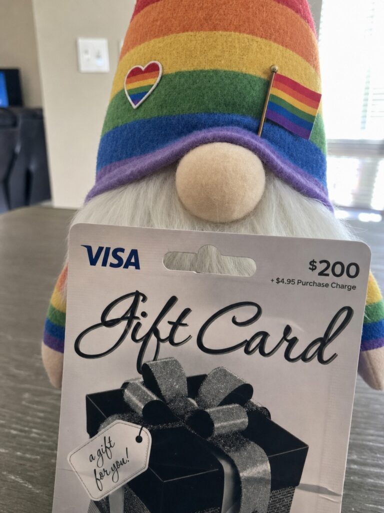
T-Mobile Tuesdays has an AMOE entry for a chance to win a $200 Visa eGift card plus a $200 Atom Tickets movie credit. You do not need to be a T-Mobile customer to use the AMOE entry route.
Quick guide
This page is structured so readers can quickly understand the prize, eligibility, entry route, and important fine print before leaving for the official AMOE page.
Enter through the official AMOE page
The official rules say non-customers can participate through the AMOE page, and all participants have the same odds regardless of entry channel.
What is the T-Mobile Tuesdays prize?
This Week #519 sweepstakes is presented as a “Prepaid Gift Card and Atom Tickets Prizes” promotion. The visible AMOE prize page describes it as an “Ultimate Dinner and a Movie Bundle,” and the official rules state that each grand prize includes a $200 Atom Tickets Movie Credit plus a $200 Visa eGift card.
The prize value is straightforward: each grand prize has an approximate retail value of $400. The rules list twenty-five grand prizes total, which puts the total approximate retail value for the promotion at $10,000.
| Prize | $200 Atom Tickets Movie Credit and $200 Visa eGift card |
|---|---|
| Per-prize ARV | $400 |
| Number of prizes | 25 grand prizes |
| Total ARV | $10,000 |
Important dates to know
The promotion period begins at 5:00:00 a.m. Eastern Time on Tuesday, May 12, 2026, and ends at 4:59:59 a.m. Eastern Time on Tuesday, May 19, 2026. That makes this a short weekly entry window, so readers should not save it for later if they plan to enter.
The random drawing is expected to happen on or around May 21, 2026. According to the rules, potential winners are notified by DocuSign and/or phone within approximately five business days after the drawing.
Who can enter?
The sweepstakes is open to legal residents of the fifty United States, the District of Columbia, Puerto Rico, and the U.S. Virgin Islands who are at least eighteen years old at the time of participation. Standard sponsor, prize partner, administrator, employee, household, and immediate-family exclusions apply, and the promotion is void where prohibited by law.
To enter, participants need internet access, a valid email address, and a valid phone number. The AMOE rules also say entrants must provide the requested registration data, including a physical address, and no P.O. boxes are allowed.
| Age | At least 18 at the time of participation |
|---|---|
| Location | 50 U.S. states, D.C., Puerto Rico, and U.S. Virgin Islands |
| Needed | Internet access, valid email, valid phone number, and physical address |
| Limit | One entry per person, valid email, and mobile number during the promotion period |
How to enter using the AMOE page
The AMOE route is the simplest option to explain because it is designed for people who are not entering through the T-Life app. The official rules state that non-T-Mobile and non-Metro by T-Mobile customers may visit the AMOE page and follow the instructions to register for one sweepstakes entry.
Open the official AMOE link.
Use the entry button on this page so you land on the official T-Mobile Tuesdays AMOE prize page.
Read the rules on the page.
Confirm the promotion name, deadline, eligibility, and entry limit before entering your information.
Complete the registration form.
The rules say the form requests your first name, last name, email, phone number, physical address, city, state, and ZIP code.
Submit only once.
The limit is one entry per person, valid email, and mobile number via either the App or AMOE page during the promotion period.
What happens if you are selected?
If you are selected as a potential winner, the rules say you may be contacted by DocuSign and/or phone. The potential winner must respond within two business days of being notified, and the prize claim process may include completing required documents such as eligibility and liability/publicity releases where legal.
For the Atom Tickets portion, the rules state that winners who do not already have an Atom Tickets account must create one. The Movie Ticket Credit is valid from receipt through July 31, 2027 at 11:59 p.m. PT, and unused credit expires after that deadline.
Frequently asked questions
Do I need to make a purchase?
Do I need to be a T-Mobile customer?
How many times can I enter?
What is the total prize value?
When does the sweepstakes end?
How will winners be notified?
Can Puerto Rico or U.S. Virgin Islands residents enter?
Before you leave this page
This compliant high-RPM layout uses deeper article content, natural in-content ad breaks, clearly labeled advertisement areas, and strong mobile readability instead of risky overlays or fixed sticky ad units. That keeps the page valuable for readers while still creating more viewable, policy-safer ad opportunities throughout the article.
| Entry limit | Only one entry per person, valid email, and mobile number during the promotion period. |
|---|---|
| Contact info | Use an email and phone number you actually monitor because potential winners may be contacted by DocuSign and/or phone. |
| Address | Use a physical address, not a P.O. box, according to the official AMOE rules. |
| Deadline | Enter before May 19, 2026 at 4:59:59 a.m. ET. |
Ready to enter?
Tap below to open the official T-Mobile Tuesdays AMOE prize page for the Prepaid Gift Card and Atom Tickets prizes.
(function () {
var end = new Date(‘2026-05-19T04:59:59-04:00’).getTime();
var ids = { days: document.getElementById(‘days’), hours: document.getElementById(‘hours’), minutes: document.getElementById(‘minutes’), seconds: document.getElementById(‘seconds’) };
function pad(n) { return String(n).padStart(2, ‘0’); }
function updateCountdown() {
var now = Date.now();
var diff = Math.max(0, end – now);
var days = Math.floor(diff / 86400000);
var hours = Math.floor((diff % 86400000) / 3600000);
var minutes = Math.floor((diff % 3600000) / 60000);
var seconds = Math.floor((diff % 60000) / 1000);
ids.days.textContent = pad(days);
ids.hours.textContent = pad(hours);
ids.minutes.textContent = pad(minutes);
ids.seconds.textContent = pad(seconds);
}
updateCountdown();
setInterval(updateCountdown, 1000);
var progress = document.getElementById(‘progress’);
function updateProgress() {
var scrollTop = window.scrollY || document.documentElement.scrollTop;
var docHeight = document.documentElement.scrollHeight – window.innerHeight;
var pct = docHeight > 0 ? (scrollTop / docHeight) * 100 : 0;
progress.style.width = pct + ‘%’;
}
window.addEventListener(‘scroll’, updateProgress, { passive: true });
updateProgress();
})();
window.adsbygoogle = window.adsbygoogle || [];
document.querySelectorAll(‘ins.adsbygoogle’).forEach(function () {
window.adsbygoogle.push({});
});
Helpful Freebie Mom Guides
Keep going